Siren
Safety-focused dating app prototype
ROLE
UI Design
Prototyping
User Interviews
TEAM
Jasmine To (Team Lead)
Anderson Fisher
Bibilomo Sanni
Timya Harden
Wineury Almonte
TOOLS
TIMELINE
Figma
Miro
Discord
Teams
Google Slides
September 2023 - November 2023 (4 weeks)
Project Overview
Siren is a safety-focused dating app prototype. The goal of our project was to design and develop a safety-focused dating app that redefined the online dating experience by prioritizing user safety, promoting responsible interactions, and providing a platform where individuals can forge connections with confidence.
The inspiration for the Siren app was the insurgence of social media users venting about meeting people with “red flags” (toxic personality traits) on dating apps.The app idea was pitched to the class by our team leader Jasmine To in August 2023. We designed this app for our Interaction Design II class, where we were taught and followed the Lean UX Design method. Our team spent roughly four weeks in the fall semester in design sprints working on our prototype.
Problem Space
Take a Sneak Peek
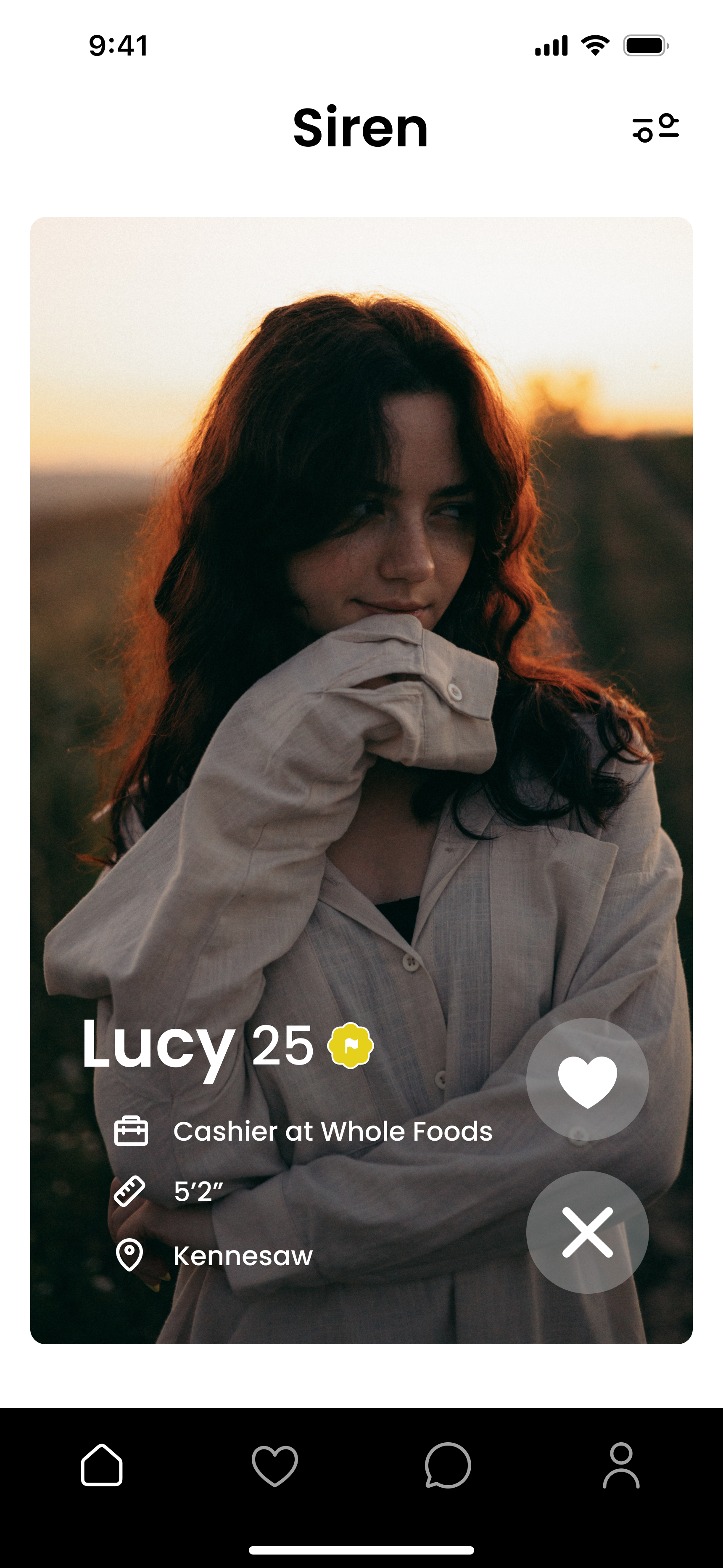
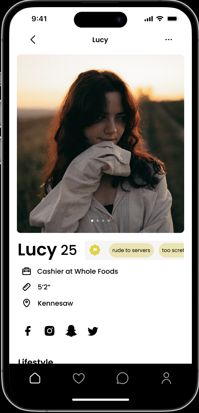
The results of this project was a dating app prototype that uses an original concept of "red", "yellow", and "green" flags to identify harmful users based on reports. Creating a secure and enjoyable environment for individuals seeking meaningful connections.
The current state of safety in online dating has focused mainly on quick matches without proper analysis of potentially dangerous users.
Our Approach: Lean UX Methodology
For this project we used the Jeff Gothelf's Lean UX method within our team's capabilities to run experiments to evaluate our user assumptions. The Lean UX design method follows a canvas consisting of 8 boxes. We began our project by going through each box and documenting what we believed to be the answer/solution to the prompts in each box.
Lean UX know for its suitability in dynamic environments where adaptability is essential for product development making a university environment a key choice. However, due to this being a school project, we were limited to the extent we could carry out this design method. One of these limitations was that our team consisted only of designers and was not cross-functional (i.e working with developers or other teams).
Jeff Gethelf's Lean UX Canvas
Product Problem Statement - Box 1
For Box 1, we had to jump into the shoes of hypothetical stakeholders and perform some role playing. Our team worked through an exercise is to refine the business context for your hypothesized product. This was done through individual ideation notes performed by each team member in response to the prompts of: “The domain we are working in is”, “That domain has primarily focused on”, “Existing products/services fail to addres”, “Our product/service will address this gap by”, “Our initial focus will be”, and “We will know we are successful when we see”.
In answering these prompts we created the following new product problem statement to address our problem space:
The current state of safety in online dating has focused mainly on quick matches without proper analysis of potentially dangerous users. Existing products/services fail to address is the lack of safety features such as background checks and profile reviews. Our product/service will address this gap by filtering out partners that have unsafe/unwanted behaviors. Our initial focus will be young casual dater and we'll know we are successful when we see a decrease of profile reports
Our Assumptions
When discussing our expected outcomes for the product we used prompts to air out all our assumptions of our users and the product overall. We made these assumptions based on business outcomes, our persona's needs, user outcomes and possible solutions. Some of these assumptions included the following:
Continuous usage of the product looks like finding people that match your interests while also understanding ill behaviors and we will know this to be true when there are consistent returners to the app meaning our service provided enough information before the date
Our user is trying to fiind the right person that fits their needs safely
Our product gets the user closer to this goal by by filtering out potentially harmful people or those with wrong intentions
The behavior change we can observe that tells that they've achieved their goals is more real connections and the user being less focused on making a lot of matches
During this process the user wants to. feel safe meeting potential dates. After this process users want to be able to find people who align with their needs
The user would seek out our product because other apps don't provide the safety features they would like to feel more safe
Business Outcomes - Box 2
For Box 2, we were posed with two questions of “How will we know we solved the business problem?” and “What are we going to measure at various stages?” Our team was limited in our knowledge of metrics but we used our understanding of design and drew from things we noticed when looking at other user interfaces and what business outcomes we gathered they used. After some individual ideation among team members, we came up with the following business outcomes:
We can be promoted through dating apps/sites partnered with us
Continuous usage is finding people that match your interests while also understanding ill behaviors
Monetizing through paying for premium user experiences
Gaining new users through social media promotion
Our Proto-Persona - Box 3
For Box 3, our team needed to create a proto-persona based on the collective assumptions we had been able to make so far about our product’s users. Proto-personas act as a culmination of who we best assume our users to be. With the Lean UX process, we were expected to refine this proto-persona as time went on to improve its accuracy based on the research we gather.
To create this persona we discussed as a team what type of users we think we will target. We also referenced our new product problem statement to recall what we described our target audience as. We were able to narrow our users down to one persona that we believed would most likely be our target audience with our persona “Aubrey”. Aubrey’s primary need is to have help looking for connections with safety in mind and has traits of being single and anxious to connect with others.
Solution 1
Solution 2
User Outcomes - Box 4
For Box 4, we looked at what behavior changes and benefits we should envision for our users. To do so we answered prompts concerning what we believe our users want to accomplish while using the app and how they would like to feel during and after this process. Also, taking the time to evaluate the proto-persona needs we had just created. With this, we came up with the following user outcomes:
Users are trying to find the right person that fits your needs safely
Our product brings them closer to the goal by filtering out potentially harmful people or those with wrong intentions
The behavior change we are looking for is more real connections - user isn’t focused on making a lot of matches
Users will seek out our app because other apps don't provide the safety features they would like to feel more safe
Solutions - Box 5
For the 'Solutions Box' our team defined a solution that satisfies business problems & meets the needs of your proto-persona. We did this through creating sketches of possible interfaces that could solve our problem space. Our goal was to align on a single solution or combine multiple solutions together. Based on popular demand, we decided to combine two ideas together.
Our Proto-Persona
Solution 3
Hypotheses - Box 6
Hypothesis Statements
What's the most important thing we need to learn first? - Box 7
Prioritizing Hypothesis Statements Based on Risk & Value Factors
Solution 4
Solution 5
For Box 6, we worked together to combine our assumptions from boxes 2, 3, 4 & 5 into the following hypothesis statements that we would strive to make more accurate over the course of the design process. Each hypothesis statement focused on one proposed element for the application and were listed as pictured:
For Box 7, we prioritized we were tasked with prioritizing our hypothesis statements based on risk & value factors. We learned that “High Risk + High Value” are good candidates for Lean UX experiments, and so we kept this in mind when prioritizing each statement to ensure we would feel confident in the experiments we decided to carry out.
What's the least amount work we need to do to learn the next most important thing? - Box 8
Minimum Viable Products (MVPs)
Required video call feature
Reports call-outs feature
Our team considered our top five hypotheses independently and discussed how we might validate an assumed behavior change we would like to see in our user. For each of the five hypothesis statements, we asked what behavioral assumption we were looking to validate of our persona and how we could bring this to life with an experiment that could augment that experience for the user. These would be our Minimum Viable Products (MVPs) - acting low-fidelity versions of our prototype to gain feedback for our product development.
After some discussion, we determined the following two features as our MVPs:
These two features are what we would test in our upcoming sprints. Out of all our proposed product features, we belived these two to have the highest risk but the highest value and believed they would provide valuable user information in the provided timeframe of our sprints. Our next step was determining possible experiments we could use to validate the behavior changes during our sprints which I further discuss below.
Sprint 1
Our Sprint one hypothesis was that we will achieve increased usage if Aubrey can identify harmful people with a “reports callout” (display of how many times a person has been reported). This feature was important for us to experiment with as this was one of the main differing qualities of our app to other dating apps. We knew it was risky for users to see other users listed as “red flags” but it was an important aspect of us keeping all users safe. We also needed to gain insight into how users would interpret these flags - whether they would choose to completely avoid users with flags or take caution based on their expectations.
Week 2 Experiment
To execute this experiment, we created low-fidelity fake profiles on Figma with different reports (lots of warnings, few warnings, no warnings) and asked if people on our campus if the would still want to get to know the person. We received varying responses that helped us spot user behaviors and whether users would match with someone with yellow or red flags.

Results
Sprint 2
Week 2 Experiment
‘Red Flag' fake profile
What we discovered?


We gained the following insight from this round of experiments:
Users liked their reports hidden and not in other users' face
Reports should only be on the profile and anywhere else would be too much
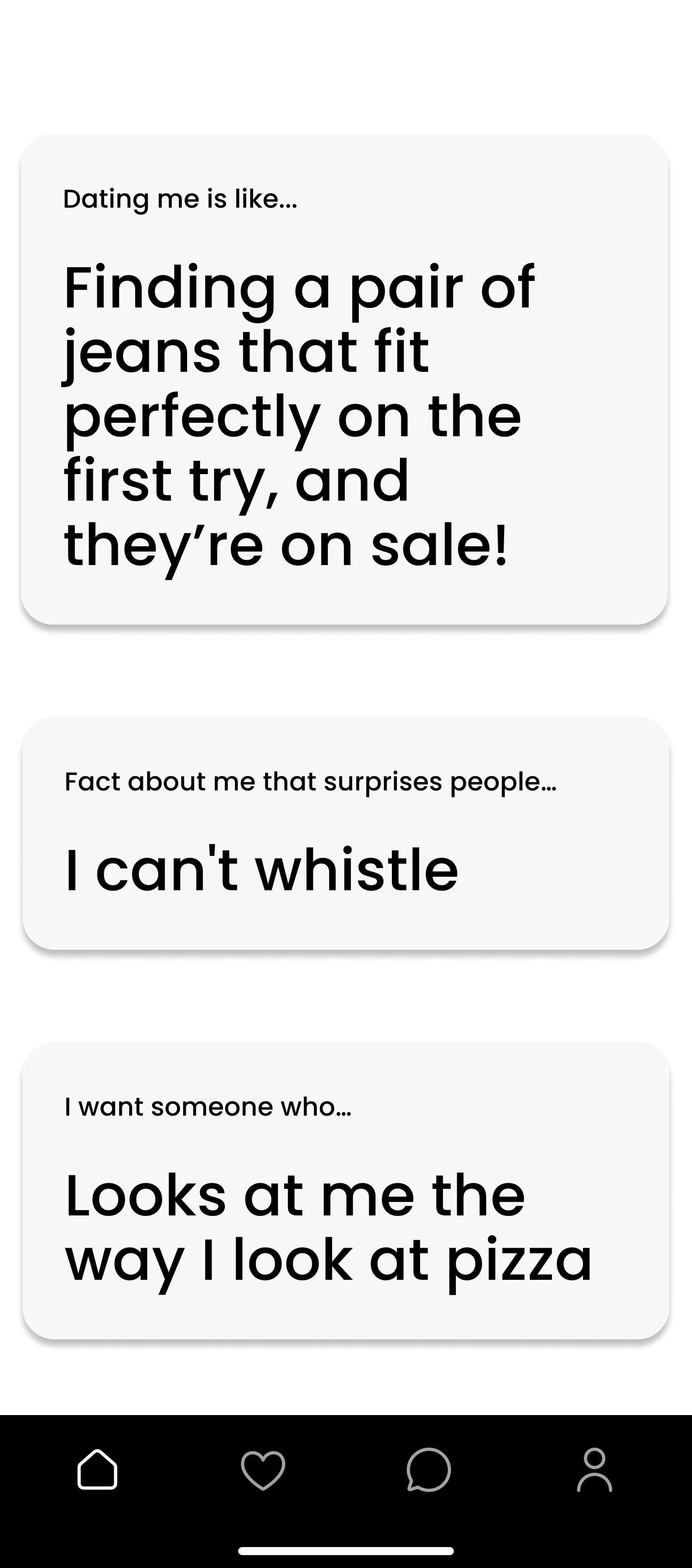
Taking this into consideration, we started to work on our high-fidelity prototype. Our first priority was creating a hidden pull-out feature for the reports a user had, as seen in our screens below:
Our Sprint 2 hypothesis was that we will we will achieve increased usage if Aubrey can identify harmful people with a required video call (after a set # of texts). This was also important for us to experiment because as designers we were aware that users don’t typically enjoyed being forced to perform an action. However, it was important to us to require a video call to avoid acts such as “catfishing”, where users pretend to be someone they are not. To prioritize safety in our app we aimed to see how users would interact with this feature.
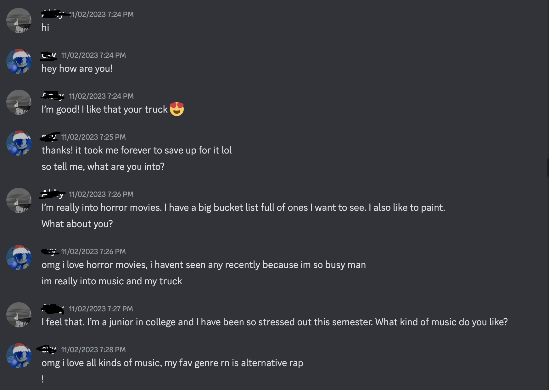
To execute this we had a text & video call between two strangers (participant & team member) on Discord. A team member plays the role of someone who is a yellow/red flag (catfish).
We were looking for behaviors of if the user recognize date is a catfish and unmatch after video call.
We chose this fidelity since users in the app would primarily communicate via texts before they would be forced to have a video call.
What we discovered?
Users noticed catfish during video call
Users did not call catfish out
Users would be friends but not date
Users unmatched with date after the call
Week 3 Usability Testing
For our final round of usability testing we presented users with our high-fidelity prototype. At this point in the process we wanted to gain insight into any usability issues are app may have had and ensure there was ease of understanding of features, especially the ones that were most likely new to users

Results
‘Yellow Flag' fake profile
Having green/yellow/red flags on dating profiles would make users feel safer
Green flags give users a sense of clarity
Users are willing to date people with yellow flags
Some felt that people with red flags should be banned from the app completely
Users were confused about how the color of the flags was determined
Week 3 Usability Testing
We used this newly gained user research to inform the beginning of our prototype process by creating medium-fidelity interfaces depicting how flags could be displayed on users’ profiles. We again went through the process of asking individuals on our campus to participate in our experiment by swiping through the screens we designed and asked questions about how they perceived the profile shown to them and what their next steps of action would be in the scenario that this profile was presented to them in an app.


Discord chat experiment

High-Fidelity Prototype Features
There was a scheduling issue - users have no way of scheduling a video call after reaching message limit
Users prefer to schedule calls through text rather than something more formal
We used this to inform our prototype and created a feature that prevents users from calling before they reach a number of texts and also notifies them when they have limited messages left before a required call
Catfish Image
The following are some insights we gained from our usability test:
Catfish Image
Reflection
I learned a lot working on this project as using Lean UX was a learning curve especially for someone with perfectionist tendencies. After the first sprint, I could see all the benefits designing an interface with this methodology. It allowed me to be more flexible and to just design without overthinking. I also saw the benefits of conducting experiments as opposed to heading straight into a wireframe. Through our experiments I could really gauge users' behaviors and why they make certain choices in way that was different from a standard usability test.
With this, it is important to note we could have gone further in our prototype if there were more iterations of sprints but due the time constraints of our course we were limited to what we worked on. Overall, I gained hands on experience working on this project and hope to use this new found experience in future endeavors.